How to create iOS 16 Lock Screen widgets in Sketch
Design a Lock Screen widget for iOS 16 — and test it with different colors using Tints
With the release of iOS 16, iPhone users can now add widgets to their lock screens to see useful information fast — then customize the colors of their clock and widgets using new controls. But how do you make an iOS 16 widget and test out its design in a mockup? In this guide we’ll take you through the steps of designing your widget in Sketch, and a simple way to test a range of colors on different wallpapers.
Let’s go!
1. Create an Artboard for each widget size
First, you need to create three Artboards — one for each of the three widget types. Create a 137x27 Artboard and name it Text Widget. You’ll also need one at 60x60 — name that one Small Widget. Finally, for the larger rectangular widget, go for a 160x60 Artboard and name it Large Widget.
It’s also a good idea to give each of these Artboards a darker background color, as it’ll allow you to test your semi-transparent design elements more effectively. You can do that over in the Inspector.
Give your widget’s Artboards darker backgrounds so that you can see the white elements you add to them later.
2. Choose what your widgets should show
Now that you’re all set up, it’s time to start considering your users. Think about what useful information your widgets could show — things like steps walked or upcoming appointments — and create some options for simple designs based on that. In our case, we’re creating some widgets for a reading tracking app, which shows how much you’ve read of your current title, how long you’ve spent reading each month, and more.
Before you get started with your designs, you should also download Apple’s official iOS fonts — we’ll be using SF Pro Rounded in this tutorial.
3. Build your widgets using white elements
Let’s start building. Make sure that all the elements of your widget are white (#FFFFFF) — this will make it easier to adjust colors later. For the Small Widget, focus on a circular design — this will best match Apple’s own small widget style.
Text and icons should be solid white for best legibility. But it’s also worth considering secondary information or background elements that don’t need to be so prominent. You’ll still want these colors to adjust with the rest of your widgets as you test them with different backgrounds. So how do you make them work?

Make sure all the design elements you create are white for now — this way, you can use Tints later to test different colors on a Lock Screen mockup.
4. Make some elements semi-transparent
For these elements, first make them solid white, then reduce that layer’s opacity to around 30–40%. This will help the colors in your wallpaper show through the layer very subtly. Next, add a Background Blur of around 10 to the layer, and set the white fill’s blend mode to Overlay.
For now, these elements will just look slightly gray on your darker Artboard background, but when you test them on a real wallpaper or mockup, it should show its true colors.
Once you’re happy with all your widgets, turn them into Symbols.
Using a mix of solid white and slightly faded elements will give your widgets more context and make them more glanceable.
5. Add Lock Screen UI elements as Symbols
It’s nearly time to see how these look on a Lock Screen — but first, we need a few more elements to build the rest of the Lock Screen’s UI! You have two options here. You can duplicate our demo document and grab all the Home screen elements you need from there, or you can download Apple’s iOS UI kit and build your own Home screen. Don’t worry — these elements won’t need to change with the rest of your UI when you adjust colors.
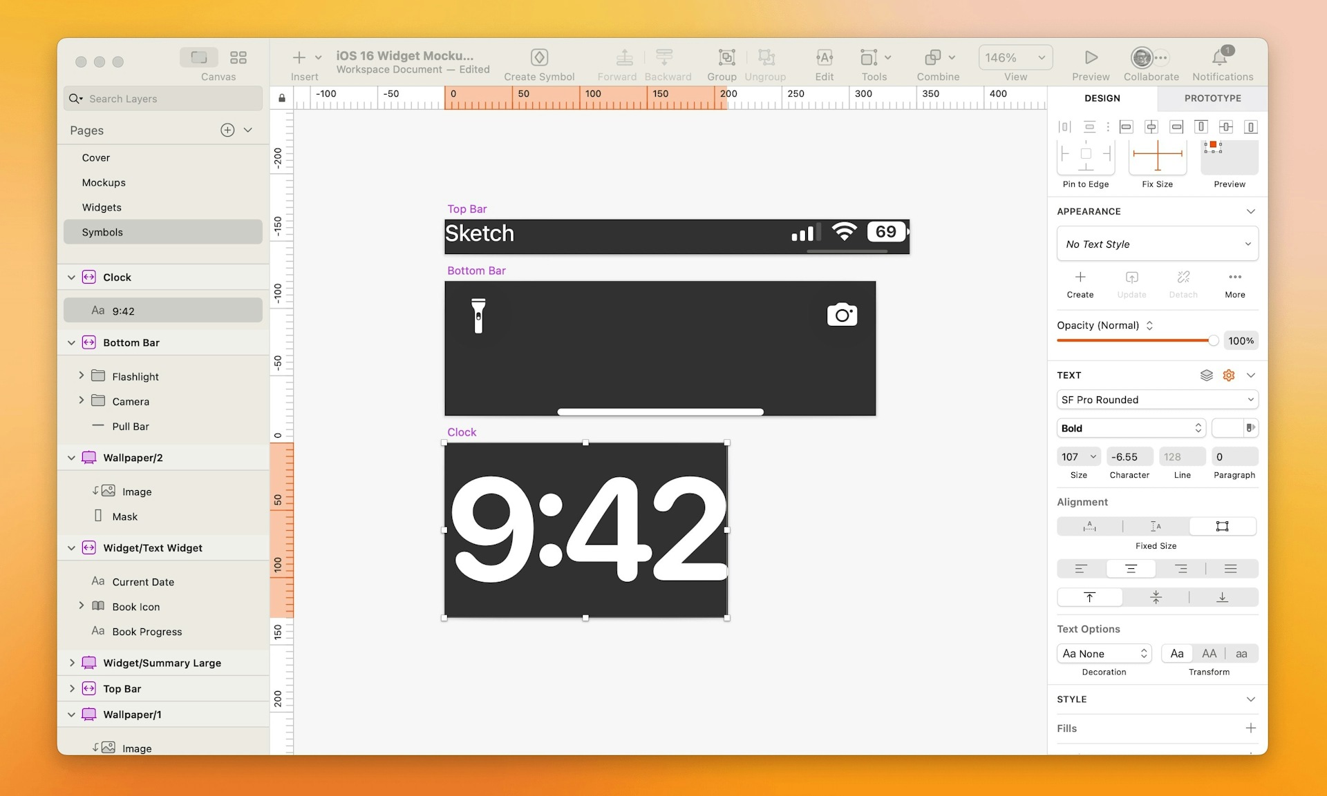
The clock, however, will. So let’s create one! First, make an Artboard that’s around 210x130, and add a text box to it. Type in your chosen time, set the font to SF Pro Rounded in Bold, turn the text white (#FFFFFF) and set the size to 107. Congrats — you’ve got a clock!

To properly test your widgets, you need to mock up a Lock Screen — thankfully you can grab most of these elements from Apple’s own UI kit.
6. Test your designs on a Lock Screen mockup
Now it’s time to test your creations. Create an Artboard using Sketch’s built-in iPhone 13 Pro Max template. Add a wallpaper background, then begin adding your UI Symbols to populate your screen.
Finally, add your widgets and your clock to the screen. Everything will appear in white, but your semi-transparent elements should be a little more faded, and take on some of the hues that sit behind them.
But what about those color changes we talked about?

When you add your clock and widgets to the mockup Lock Screen they’ll be all white — but we can change that using Tints.
7. Test different color options using Tints
Time to break out some Tints. Select all of your widgets and your clock layer, Control-click and choose Group Selection from the context menu. Then select the whole group and add a Tint in the Inspector. You can now test out different hues to see how your widgets will look on different backgrounds, or for different situations.
By adding a Tint to the group and adjusting the hue, you can test out how your widgets will look in different situations and on different backgrounds.
That’s it! You just learned how to create widgets for the iOS 16 Lock Screen — and test them with different color customizations. Now it’s time to try out some widget designs ready for launch. Don’t forget to share your creations with us on Twitter using #MadeWithSketch. We’d love to see what you make!


